Monday, May 22, 2017

Q4 Project

           Bonjour!! Comment ça va? Je suis fatiguée car des finales et je suis très nerveuse! 

          Hello, how are all of you? I am tired and very nervous for finals. The tests coming up are very big and tomorrow we are typing our final blog for this class. But this quitter we have been creating  a product of our own design and mine/my teams was Live Stickers and we created many things like a commercial and lots of graphics. With out further a-do let's jump right in.

Brain Storming 


    Our first task was to brain storm our product info like our product name and what our product was. After many hours of hard thinking I thought about some of my favorite movies more specifically Harry Potter. I thought about some of the more magical elements and than it came to me. Sticker that come to life when they are put on any hard surface. My group liked it so we did the idea and had to figure out colors and a slogan. For colors we wanted something with bugs, greens, and yellows so we made the Dino green and the title blue and white. We choose a Dino for the "face" of our product because I felt like it would appeal to more kids and we could do a lot of cute things with him. Next we worked on company name, we eventually choose Imagination Station after many, many days of thinking and looking at examples. For this we wanted it to be bold and creative since it's imaginative. 


Process (For Everything) 


-Video 


    We went into video first so we created a commercial, I wanted mine to be entertaining but cute for our target audience which is children 4-13 but I mean anyone can buy our product. So I wanted to do something with our little Dino friend. A group member named arson was out filmier and helped us get good shots while giving us creative ideas. We filmed many shots and even had some stop animation that Carson and I did. I made the frames while he took the pictures. After we got all the shots filmed I spent a week or so on our commercial to try and give it that special feeling that would leave children hooked. I choose the song Happy because it's a carefree song that gave fun feeling and go happy feels. We were all supposed to work on one and only Carson and I did so it was a battle to see who's would be on the website, and honestly I think Carson's should've because he's was more dramatic and funny while mine was cute. I think both our ours were good but I did a lot on the website so think that his should've been featured. 


Commercial For Live Stickers 


-Product Logo


     Next we did graphic design which is where all the logos and coupon designs come from, really we just did all the designing there for our product. First we worked on our product logo and I spent a day on it I wanted the Dino to be smiling so I did the wink to try and make him appear really happy, which I think worked our pretty good. I also kept the original color scheme with the blues and greens as much as I can. This took me a few days to finish because I wanted it to be very clean and cute looking, which I think the end result turned out to be pretty good. One of the first sketches was the Dino having a larger head and longer nose but after drawing that out I went for a more Disney approach.
                             
Product Logo 


-Company Logo 


      After the product logo was created we worked on the company ago and I think that was the hardest logo we had to come up with, we just couldn't find anything that worked and it was hard because another one of our group member named Ramal wasn't sure on how to work some of the tools, it was look because he figured them out, but it was a bit rough at first. We decided to do a brain because that is how you imagine things and w kept the blue in our logo. I drew the brain by hand and we were in a rush so it doesn't look our best but I think it turned out pretty good.  I also added the bold black line to make it look more dramatic. 
Company Logo 


-Product Ad


    After the company logo was created we worked on the ad for our product. I left Carson in charge of the ad but Ramal and myself gave him input and suggested certain ideas, I think I made up the Dino to be the circle of the 10% but that might have been another group member. I do think that if we had used the text tool instead of hand drawing everything if might have looked better, cleaner. But than again our target audience is children so maybe the less clean way was in our favor. we also tried to match all the blues in our product add with product logo and we did that for the most part. We also added our company logo in the bottom left corner to copy right it. 
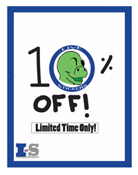
Product Ad

-Product Description


   The next thing we did was a product description type thing which was supposed to grab the audience's attention and give a little summary over the product while having the slogan somewhere, little story; our slogan took us forever to come up with, it was originally really long but we shortened it after having another groups input. We also wanted this ad to be very eye catching so we added the blue, black, and white gradient. Ramal was in charge of this part but again we all pitched in ideas to create this final product. The little words on the bottom say "Pick any sticker, stick it on any surface, and watch it come to life" which is a clever play on our slogan Pick, Stick, Live!
                                           
Product Description 

-Web Banner 


    Lastly I created the web banner about two days before we were going to animation so it may seem a bit rushed but we can call it the sloppiness that worked in our favor. It does look childish and the font only makes it look for younger children anyways. I wanted to add something different so after looking at other web banners for big companies I decided I wanted to do these little circles that drew attention but not a lot, just a little something in the background. I also wanted to keep the original blue that we had for the product logo so there is some of that in there. The web banner was easy to make, I just used rectangles and colored in the edges to make them all look them same and the circle tool to create all the little circles in the background.  
                           
Web Banner

-2D Animation


    Our last station was animation and let me tell you I loved it. The animation took me the whole two week we were working there but it turned out pretty good. I probably could've added a few more frames while he is running to make it seem faster and less laggy. I also could've made him a little bigger so people could actually see what was going on, but the animation turned out all right. We started the first day off as a review and than my team brain stormed on what we wanted to do, I mostly followed my design but there were a few tweaks because let's face it, the first version is almost never perfect. I wanted him to first see the mysterious white circle than eventually end up inside to make the product logo and that happened but I used the wrong green so there's a little fade of colors but it kind pf looks cool. Overall it looked great and I am proud for making such a cute animation in two weeks. I'm kinda mad that in the commercial it speeds up certain parts and slowed down certain parts so it looks bad and not clean, but I'm a beginner so I will learn how to fix everything in time. 
2D Animation


-3D Animation 


    So I was not in charge of the 3D animation that was Carson and Ramal and let me tell you, they both did fantastic jobs. I don't really like 3D animation, which is kinda bad if I want to make it in the big world because that's the common thing now but I just can't figure it out. So Carson did the Live Stickers packet that is shown below to showcase how many stickers would be on a packet and what it would look like in a real environment. Ramal did a 3D animation of our company logo and I know she had a hard time working on it, but I'm pretty sure it turned out pretty rockin' awesome. it took both of them two weeks to finish their animations as well and that's just because animation is such a patient hobby. They both did their part very well and although Carson forgot to add our 2D company logo, it still got the point across. 


   3D Animation Sticker Packet


What Did I learn and What Would I Change

    I learned a lot while doing this project like how to work with a group and how to get everything done within a certain time limit but getting everything done great. I learned how to get my not-so attentive group focused for class periods so that we could actually get work done. Maybe I would change some of the end products, like all my things for example, I would add tiny details and make it look neater than it already is. But I liked my group so I wouldn't change that and I liked our product and everything that was made for the most part. I would keep everything the same with the group stuff because we all got along and I really enjoyed coming to class and getting to work on the project.I would change some things with our presentation because we did not cover everything we were supposed to. For example, we did not say the target audience, we didn't show the animations, we didn't even talk about the bios page. It was kinda a mess, we also almost lost all of our work, Thank goodness we didn't. I'm just going to blame everything on nerves and we can try better next time. 


Overall I loved this and all though I felt stressed 24/7 I enjoyed making the project and working with a team that was very nice and cooperative. We could've done somethings better but where the fun in boundaries and rules. Everything is more of a guide line anyways. 

Hope every one's final tests go great and you pass with flying colors,
Sophie the First. 

Thursday, May 11, 2017

Product Animation

      BONJOUR!!!! Welcome back to my blog, today's is al about or product animation. I enjoyed making this so much so with out further a-do lets get right into the blog.


     First we had to brainstorm with our team so my group of four split into two pairs, one for the 3D animation development and my group was the 2D animation development. I suggested our "face" or dino to be messing around than suggested our dino to find  circle to get trapped in and eventually becomes the logo you know today.


     Next we got to work. The whole thing took me about 2 weeks or how ever long our animation rotation was. I was working on it the entire time to make sure everything was perfect and that the detail was good, no sloppiness. I tired to remember the rules like squash and stretch as well as the go in and go out. I accidentally made the dino's skin color a bit to green so at the end you can see the color shift and at the beginning it's a little sloppy and moves so fast you ca't really see him sniffing the air, so the small details of my animation was lost due to the speed. But it turned out ok so I'm not to worried about it.

    Overall I loved making this animation. Well I enjoy animation in general but this one was one of my favorites. It was fun to make something of my own creation and do whatever I wanted to do with the animation. I further developed my animation skills and it was a challenge to convey what I wanted to with a 2D character but I think I succeeded. It was also a little hard to create a story that was interesting but not to advanced for me, because I'm just starting to learn the ropes.

 All next time,

Sophie the First!


Friday, April 21, 2017

4th Quarter Graphic Design Project

       Bonjour mes aimes! How are all of you? It's been a while since I last blogged but i'm here now so let's get crackalackin! We have recently created a product of our own design and were put in groups to create promotions for them.

      First we created a product go but with a combination mark. So there is a picture/graphic and a word mark/product name. I went home and thought of some cute ideas for the face of our product, which resulted in a cartoony Dino winking with our product's name: Live Stickers was curved around around a circle. I didn't think of any colors until we got to or class but I did want the Dino a shade of green. Once we got to class we decided on doing a blue outline and a great shade of green that represents a childish liveness. I think he looks very Disney but overall I enjoyed crating him, even if we were in a rush. Warping the text around the blue outline was challenging but it turned out wonderful.
                                          
                                                                      Product Logo 

     Next we created the company logo which after many days of brainstorming and even some ideas from the class we created the Imagination Station. It is very catchy and I love the rhyme so it stuck with everyone. After that we thought of colors from our product logo and saw the value and got inspired. We than wanted to have an orange contrasting color but we changed it to a grey, which looks a bit neater in my opinion looks a lot neater. Than we wanted a wordmark under our company's initials so we put the words there and I helped choose the font and made the great decision to add the black bar.
   .                                      
                                                                   Company Logo 
   
       After our company logo we created the web banner, so this would be the little rectangles at the bottom of your screen, and let me tell you I could not think of anything, this was my greatest challenge. But I than decided on doing little circles in the background because our product logo is outlined with circle. We also had trouble thinking of a catchy slogan and had to get help, again. But alas we finished, and I think it turned out ok. It's a little sloppy but we tried to keep the same blues and greens throught the whole ad. 
Web Banner 
      
      I did not work on the coupon but it did turn out pretty cute. We wanted an edge around it to try and get rid of negative space and it matches the product logos color as well as the company logo. I also had an idea to make our circle product logo apart of the 0 in 10% which looks good. I wish we could've done typed writing instead of hand written stuff but it did turn out good and I guess it looks like a kid did it which is good since we are aiming this at children.
Coupon 

         Another girl in our group worked on our product add while I was doing the animation. She did a great job and I had to help with a few things but she did most of it on her own. She wanted to do something creative and original and I totally think she succeeded. She choose to have the logo which is a good idea to help promote our product, than she wanted some coors that go with our logo but that also make it pop so we choose dark blues and black to help create that gradient to make the logo pop. She than added our slogan "Pick, Stick, Live" and added a short description to help sell our product. 
       
Product Add 


        Overall I feel like my group was very pleasant to work with. We all have creative ideas that flowed through all of us and created even more and better ideas. I will say I felt like the leader, just because I had some slackers, only half the time. Usually we worked hard through the whole hour. I also did most of the work, but I had my team's input while I did so it wasn't totally just me. I liked graphic design and I'm very excited to go to animation next week.

   Merci for reading my blog and I hope you all have a great weekend. 

Love, 
Sophie the First 

Friday, March 10, 2017

CSS Web Site

     Bonjour my fellow bloggers what is up?! I have been getting all my final projects and tests done because my thrid quarter of school ended today, what a reflief to have a nice ten day break. Well in class we've been working on our final project which is....anotherwebsite. I know not the most excitin thing but it was still an interesting project nontheless. So without furthado lets get right into it.

Process
    We had helpful, really helpful videos to work us through our projects. First we changed the background color to black, after that we had to change the links at the top to a light tannish color. Next we had to change the title and subheading one sizes, fonts, and colors. After we did that we changed the text box to a cream color and then we changed the paragraph word color and font size. Lastly we had to make the dog go to the right side of the screen. All this was using Adobe Dreamweaver and it wasn't too difficult. I had trouble finding all the different font color and size options. I also, you guessed it, almost messed up the project because I had the links set up to the wrong page. I got this done pretty fast, I only used two class periods and it turned out pretty good.

What Did I learn?
     This experience was ok, I learned that for web design you must be patient, and I don't really have that word in my vocabulary. I also learned that coding is very picky so if one semicolon is missing then it won't allow you to do whatever you wanted to do.

Takeaway
      I learned that web design is probably not for me, I do think it's cool to learn how to make a website, epically because it's such a big part of everyone’s lives now, but I don't find it exciting like I do with animation and video. I know that web design is kind of important though because I could do something for my company or future job, but I'm just not that into it. 

Au Revrior my friends, I hope everything goes great for you and if your on a break or taking a vaction then I wish everything goes wnderful!
Thank you
Sophie the First.

Before the CSS  file                               With the CSS file

3D House Animation

     Bonjour!! How are all of you? I am doing well, trying to stay heathly through all this sickness but all the school days off are enjoyable. Recently we've been working on a 3D model of a house of our choice. Let me tell all of you it. was. hard!

 Process
      We used a program called Sketchup, it’s alright, but lags a lot and I’m still not getting used to all the new tools but I guess it’s a work in progress. First we choose a house to make and then we had to look at the floorplan, the back of the house, and the front. We than had to figure out the floor size..? The layout of the house, or how big it is. Then we use the push/pull tool to make it 3D. After that we had to make the roof. I had a lot of trouble trying to create the roof because 1. I am very unexperienced and 2. I just could not figure out to make the roof 3D and not get random pieces either extra or missing. After we created the roof the real fun began since most of the house was already done, right? I started part two by making the house walls a nice light/medium brownish color, then I at first made the roof a really weird unfitting color and it wasn't until later when I would discover the current and final color of the roof. After I colored everything I began the little details so the windows and all the stonework. I first created the front porch floor and the pillars and tried to make a roof but again, it was not working out, so I put that to the side and began the hard work of decorating. It wasn't that bad, a few bumps but for the most part everything worked, until I got to the porch roof. Aww man this took me forever to figure out until I just created a rectangle off to the side and put it on top of the pillars, if I tried to create the roof on the pillars I’d have extra lines than things would get deleted, it was a tough progress! After I finally finished the front I went to work on the sidewalk and the lines weren't connecting so I had to improvise, honestly I had so many problems with my house! x) So after I finally figured out the sidewalk/driveway rectangle thingy I went to work with the last touches I added a nice car and an awesome tree. The very last thing I did was add shadows and that was also a very complicated process because for some odd reason the shadows were registering as real objects so I had to move my whole house until it rested on the horizontal red line and the shadows actually worked but since I had added the tree and car it was lagging really bad so it took forever and then I had to add scenes which weren’t bad except for the fact that it took an hour to render! I only had about two minutes to finish, so I had to come in early the next day. Agh! I finally got it done though and it looks pretty good.

What did  learn?
    I definitely learned a lot and how to better use my software. I can look at problems and try to figure them out without help, for the most part and I now know how hard it is to build a house, no matter if it's real or 3D, I don't think I'm meant to be an architect.

Takeaway
     Well as I mentioned above I definitely learned how to use Sketechup better, and even if I don't like the program I can figure out how to work things. I know how hard it is for builders and kind of grew some respect for them and the person behind the blueprints as well. I'm so glad we didn't do the inside because this simple house took me like two weeks to do. I am so ready to start animating though and I know this is a step closer to my end goal.

Thank you for reading with me today, stay classy and heathy,
Sophie the First.
   

Monday, February 13, 2017

My Personality

        Bonjour!! I'm back with another blog post and today we're going to get a little deep. Yesterday we took a personality test, the Myers Briggs Personality test, maybe you've heard of it? There are sixteen personalities so I'm here to describe what I got, my type was INTJ, which means I'm an introvert, intuitive, thinking, and judging.

      Now that all doesn't make sense but i'm going to explain it. The I for Introvert means that I like more quiet spaces and I'm not exactly one fore a crowd. But I only got 9% which means that I have a slight preference over staying in then going out. The N for Intuitive means I like to find out the reason for things and I like to find the root problem, which is kinda true but again I only got 10% so sometimes things are better left unsolved, but I can also be creative as well, we did an experiment in class and the N people all wrote stories including me so I think that this was pretty accurate. The T stands for Thinking and I got 9% on that, I will say that doing math isn't terrible, when I actually know what I'm doing but for the most part I don't like to love complex problems, math is not my forte. Lastly I got j for Judging, but that doesn't mean I judge people it means I like a planned out plan before I rush into things, and I can totally say that's me for the most part. I did get 38% so I do like plans but sometimes I like to go with the flow, I guess it jut depends on my mood. Some cool people who have the INTJ the are: Adam Sandler (Who knew Adam Sandler was an introvert?!),  Julia Siles (great actress), a cool Greek guy Aristophanes, and Carrie Fisher, it's really cool that Carrie Fisher has my personality type because she was awesome as Princess Leia and her passing was very sad.
 I feel like my personality matches me about halfway. I was in the middle for everything just had slight preferences over one than the other, I prefer to be alone more than hang out with a big group of people, but at the same time I enjoy hanging out with a lot of people. I think it could be my mood that decides if I want to hang out with a group or not. I also try and make the best decisions even if means that some people will be disappointed but I try to include everyone, it’s just a slight preference, I feel like the N also makes me creative and I list and organize differently than people with the opposite traits. I try to make decisions based on what other people are feeling and try to help the so the T might not describe me all that great, but I do like to solve problems and figure out how things work. My personality type is right in the middle so I do not really think this helps me figure out why I go to different people and figure out why I do certain things.

    In a team I take on many different parts, sometimes I am elected unofficial leader other times I just want to be told what I should do, but my input is usually listened to. In my family, I am the oldest sibling so that means I hold a lot of power and am usually left in charge at home a lot when my parents make a quick errand. I think I am more of a leader then a follower, especially when I have very strong opinions on a subject. I think my personality type is kind of like a go with the flow, or at least that is how I am with stuff, I will try to make a plan, but also allow room for surprises. I will try to fill whatever is needed of me, so if I needed to help others I’ll try or if I just need to follow along, I’ll do my best. But when I can't be a leader for a certain project I'll try and do my own thing and take leadership for myself, I'll become annoyed and will try to listen. However, sometimes it does not work out. I am sort of a leader but I am quite and will listen so my fellow groupmates. 

    I think in the past people might think I'm rude because I don't talk to them or I speak out against their idea with my own, I don't try to be mean I just want to add input. People think I’m a quite one, and I guess I could say I am but when with friends I can get really crazy, so I've got a school/friends attitude. I think they are probably many people who conflict with my personality, but I try to work things out with them and avoid conflict. For example, I am not much of a talker I like to listen, so if I am with a very outgoing person I will be quite but I do not really like it when people just keep talking and talking. Or when people go against my plans that I had carefully thought out or when they just don't listen to me in general. 

    We also did a "sprit animal" type thing and I got tied with the might lion (which goes against my Slytherin pride) and the social otter. This means I like to lead, which is somewhat true, I like to be in charge during projects but not like in charge of a country. The lion is also good at making designs but I am not and sorta indecisive but it all about certain subjects and what not. I am also good at being strong and direct as well as goal-oriented which I must say is very true. Some weaknesses that come with the lion include being to argumentative which has happened to me before, as well as being to dictatorial.  On the otter side I am supposed to be very social and I can talk to much, however I am not to sure I talk to much, actually in my classes I don't talk at all. I do like motivating and helping other people stay positive and with my friends I goof-off quite a bit, as well as having a very messy room, oops. I always try my hardest with projects and don't rush them so that is another things that I think the lion takes care of rather than the otter. 

    Sooooooo, there you have it, I am the 1% of people with the INTJ type. Hope everyone is staying healthy and happy this winter,
thank you 
Sophie The First. 

Monday, February 6, 2017

My Ten Strengths

      Bonjour!! Salut! Hello my fellow bloggers, how are all of you? I am doing great, a little tired, but thats what Monday's at 9:00am feel like am I right?! Recently we've been working on our ten strengths and trying to make a video with our words. This project wasn't really an animation, more like a movie with words moving. I thought it was interesting to think of words that describe me, I don't really like talking about myself. Anyways, I thought the project was vey fun, so lets get on with it.

The Process

               
     We started this project at the end of October maybe, well that's when we thought of our ten words. Then couple weeks ago we've put them onto the screen. We used Photoshop and had to first put in a background, just any solid color. After that we added in the words using the text tool as well as changed the font too, I tried to make each word have its own font because I feel like words have different meanings and should be expressed uniquely. After that we had to find an image that best describes us. I wanted to do the mountains because I love them, my family and I always go to Colorado every summer and spend a week in the mountains, probably one of my favorite things to do in the summer. Next we had to pick a picture as our real background. The task of picking the perfect picture was a little challenging. I wanted something blueish with mountains but not everything to be blue, so I settled on a sunrise. We had to be careful when picking the photos because  everything is copy righted, so theres a whole process that must be done, but its not to bad just limits the pictures After we did all this stuff we had to put the words into the movie time line and give them special animations/movements, it all ends in a clump of words (My name is the big one in the middle).

What Did I learn

      I learned how to add special effects of movements to objects in a photoshop movie. Making the words move was't hard, you just have to make key frames--were the words will start and end up--and Photoshop will automatically move them for you, it was relatively easy to do. Adding music in was kinda hard because our teacher didn't know how to help so I was kinda going with the flow, but I think it turned out pretty great, could've edited it a bt more but its ok for my first time. I also learned how to not illegally take photos from the internet, not gonna be breaking the law no more, I'm a new women now.

Takeaway

    I had a lot of fun making this project and I thinking was nice to find words that can describe us in  positive way. I liked how mine turned out, I tried to make it constantly moving because if it went one by one it might've bored people, including me. So I tried to make it something I would try and watch too. I probably could've cut the music at the end, or at least try to make it end a little nicer because it suddenly just stopped, but I think the project turned out a-ok.

    Overall this project was a fun experience and I learned a lot about myself (cliche I  know) but it was fun to make a project based off of things I'm good at. Thanks for reading and have a great rest of your day,
Sophie the First.